Streamlining App Review posts
Writing the App Review posts requires a lot of different steps and tools to collect all of the required information about a single application.
- TextExpander snippet to generate App review template
- Blink to get additional app information
- Workflow to fetch App icon
- Union to apply mask to app icon (rounded corners)
- Workflow to resize app icon and upload to Dropbox folder
Because I have to perform these steps for each application I want to include in the blog post I found myself dreading writing these posts more and more.
I am not sure when this has been added to Workflow but it is possible to get information from Blink using an action which would make it possible to further automate this process. Combined with the following simplifications I would be able to make this work with just one single Workflow (still requires the Blink application to be installed on my devices);
- Instead of applying a masking image to the app icon let the masking be handled by the web browser using CSS
- Instead of using TextExpander for the App Review it is also possible to generate the required output directly in Workflow
The desired workflow would be performing the following steps
- Input app name and get list from App Store for possible matches
- Select app
- From the selected app get the following pieces of information and store them in variables
- App Name (Name)
- App Developer (Artist)
- App Icon (Artwork)
- App Version (Version)
- App Size (Size)
- Platform (Supported Devices)
- Requires (Minimum OS Version)
- Price (Formatted Price)
- Using Blink get the affiliate link (using the App URL) and store it in a variable
- Get the name to be used for the App icon and store it in a variable
- Resize the icon to the dimensions 100 by 100 pixels and upload it to Dropbox using the name specified during the previous step
- Generate the HTML/Markdown code for the app review and copy it to the clipboard
Building the workflow
Most of the steps within this workflow are straightforward, but the ‘View Content Graph’-action has been indispensable in figuring out what types of data was being returned by the several actions used. Also while building the workflow some actions did not return the information the way I was expecting or hoping for.
- ‘Search App Store’ does not allow setting the store to be searched using a variable or input
- Numeric data is formatted based on the regional settings of your iOS device. In my case this happens to be a different format than I am using on my blog
- The Artist (or Developer name) of the ‘Get Details of App Store App’-action returns more data than expected
For selecting the application to be reviewed the following I started out with the following steps
- Ask for Input (application name)
- Search App Store
- Choose from List
- Set Variable
APP_SELECTED
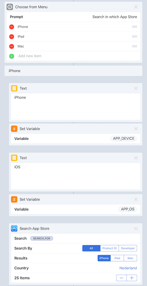
But since you have to specify the type of applications to be returned (iPhone, iPad or Mac) within the ‘Search App Store’-action a different setup is required. I eventually ended up with three blocks of actions
- Ask for Input
- Select platform (iPhone, iPad or Mac) and performing the search (also set some variables to track selection)
- Handle empty search results from App Store. Exit the workflow when nothing is found or selected
 Flow for searching the App Store
Text Replacements
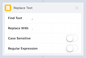
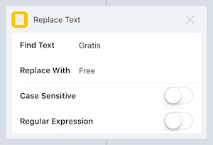
Numeric formats used on my iOS devices (Dutch) is different from the format that I am using on the blog (US/UK), so I also required additional actions to convert the numbers returned by the ‘Get Details of App Store App’-action (for ‘Download Size’ and ‘Formatted Price’) to replaced , by .. Also in the case an application is free it is returned in Dutch.
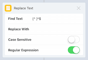
Getting the name the application developer (Artist) not only returns the name of the developer but also an URL. I don’t want to include this URL so again additional actions had to be added to remove this URL using a regular expression [^ ]*$
 Action ‘Replace Text’ Number Format
 Action ‘Replace Text’ Free
 Action ‘Replace Text’ regular expression
Text
The last step is mainly a big block of text making use of the numerous variables declared within the workflow (APP_AFFILIATELINK, APP_DEVELOPER, APP_IMAGENAME, APP_NAME, APP_NAME, APP_OS, APP_PLATFORM, APP_PRICE, APP_SIZE and APP_VERSION)
<table>
    <thead>
    <tr>
    <th style="width:105px; padding: 2px"><img class="appicon" src="/public/APP_IMAGENAME" alt="APP_NAME"></th>
    <th colspan="2" class="alignleft">[APP_NAME](APP_AFFILIATELINK)</br />APP_DEVELOPER</th>
    </tr>
    </thead>
    <tr class="aligntop"><td>Version</td><td width="100px">APP_VERSION</td>
    <td rowspan="5">
INSERT APP REVIEW OR INFO
    </td>
    </tr>
    <tr class="aligntop"><td>Price</td><td>APP_PRICE</td></tr>
    <tr class="aligntop"><td>Platform</td><td>APP_PLATFORM</td></tr>
    <tr class="aligntop"><td>Requires</td><td>APP_OS APP_REQUIRES or newer</td></tr>
    <tr class="aligntop"><td>Size</td><td>APP_SIZE</td></tr>
</table>
<br />
CSS
To simulate the App Store masking the following CSS has been added to my blogs CSS file
/* App Store Icon */
.appicon {
  border-radius      : 18px;
  -webkit-box-sizing : border-box;
  -moz-box-sizing    : border-box;
  box-sizing         : border-box;
}
You can download the ‘Prepare App Review’-workflow using this link and modify it to fit your own needs.